Brand
GloReal InvestmentsRebrand
A full rebrand for a real estate investment company — new logo, business cards, and a presentation folder.

GloReal Investments
- 01
The task
The client had grown from a small agency into an investment group — the old logo and materials no longer matched the business's scale.
- 02
The solution
Designed the new GloReal mark — a blue-green-yellow leaf symbolizing growth, reliability, and international reach.
- 03
Design
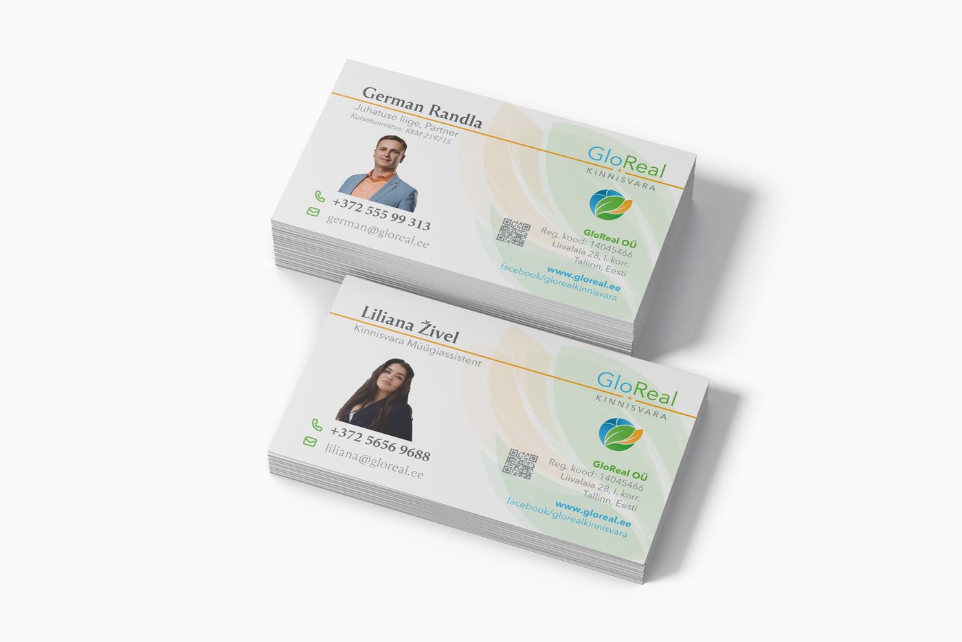
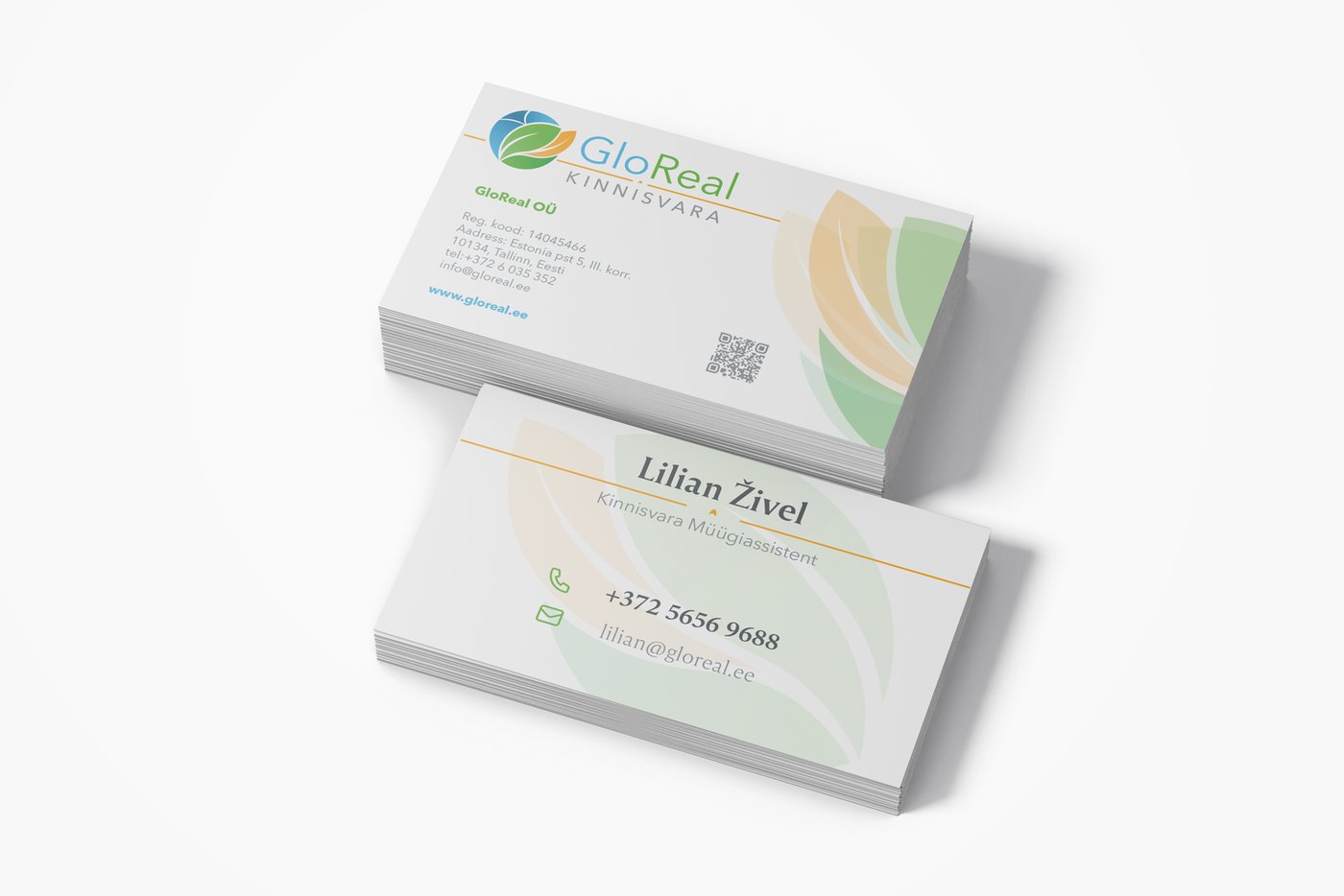
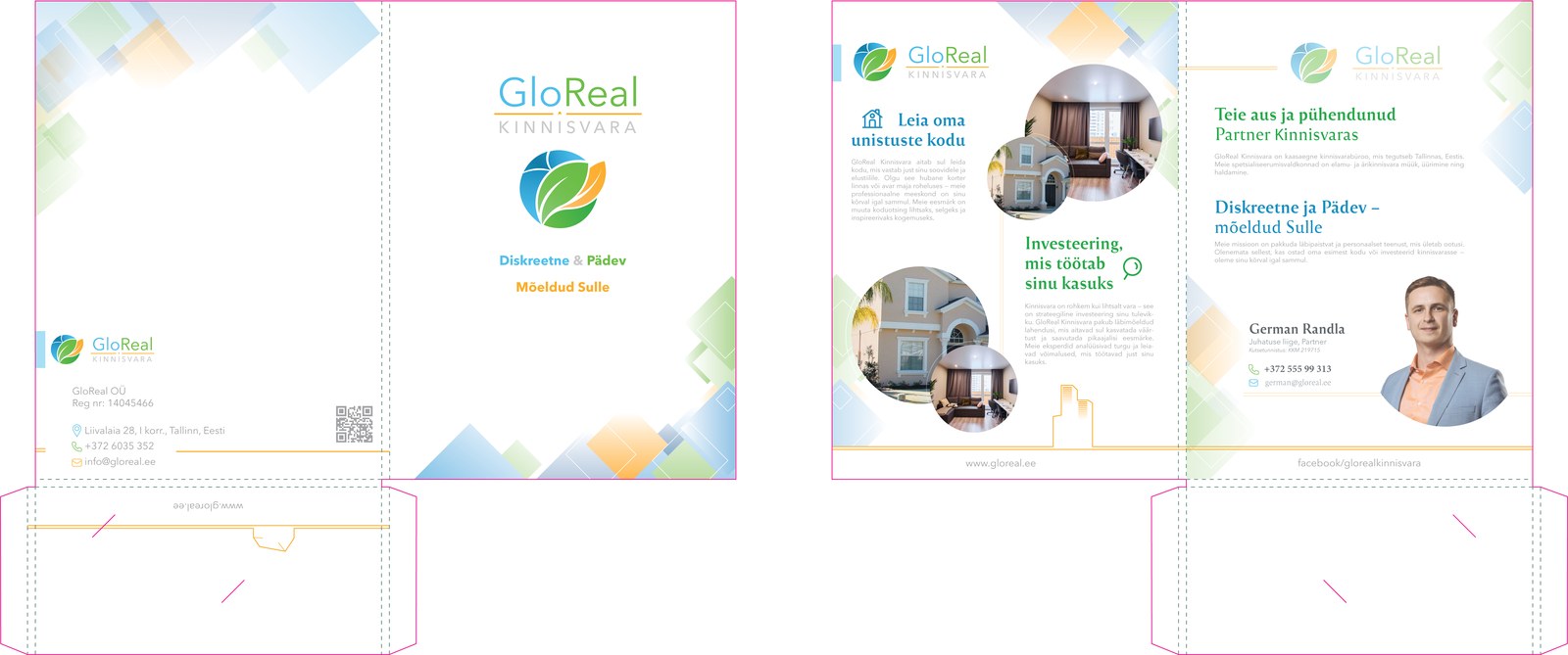
Carried the new identity across touchpoints: team business cards and a presentation folder for investor meetings.
- 04
The result
The rebrand is complete and in use across all company materials; the project continues to expand.
Images
3 spots left in October
Contact
Tell me about your project
I reply within one working day. The first 30-minute call is free.